Case study · Design and CV writing
A CV template system
built to pass twice.
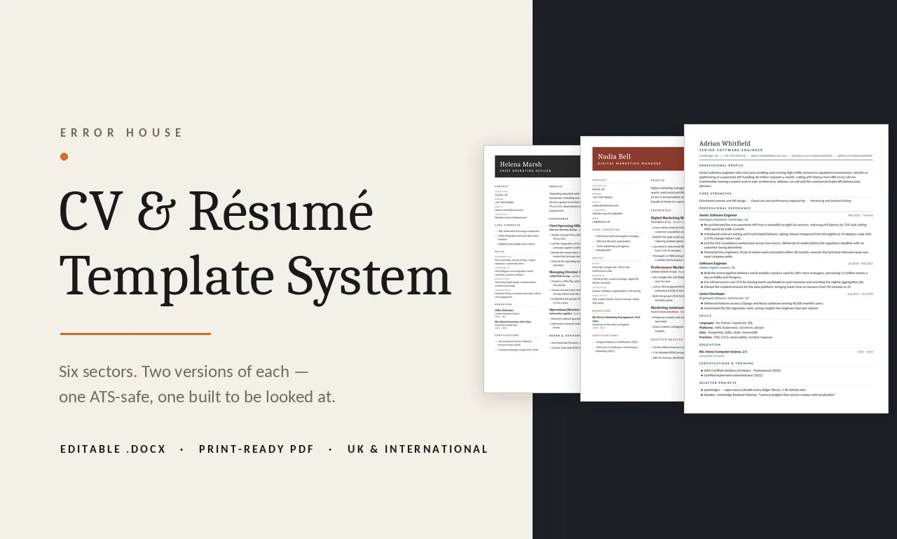
Twelve templates across six sectors, in two versions each — one engineered to survive an applicant tracking system, one designed for the person who reads it afterwards. This is the system behind every CV I write.
The problem with a good-looking CV
Most CV templates you can buy are two-column, icon-heavy and full of skill bars. They look expensive. Then they go through an applicant tracking system, the parser reads the page in the wrong order, half the work history lands in the wrong field, and a qualified person gets filtered out before anyone human is involved.
The usual answer is to strip everything back until the document is dull. That is not a fix either — a recruiter still has to want to read it, and a dull CV in a stack of forty is its own kind of filter.
So I stopped treating it as one document. A CV has two jobs and they have different constraints, so I build two files.
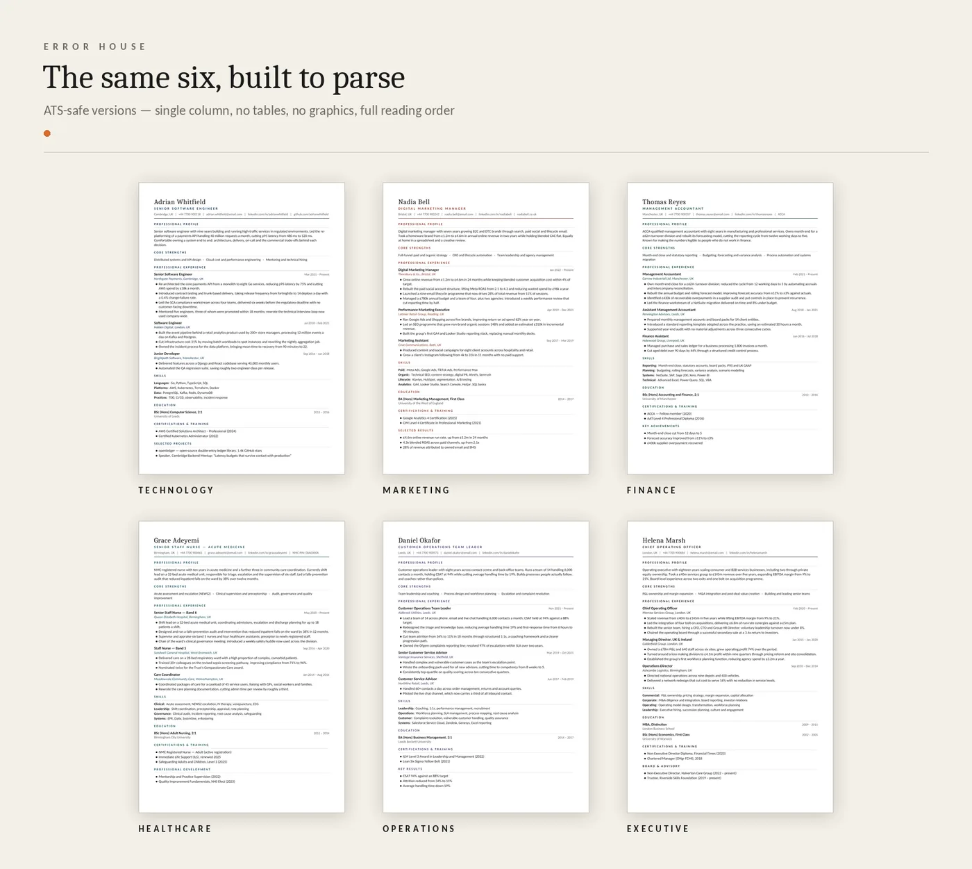
The ATS-safe version
Single column, in strict reading order. No tables, no text boxes, no columns, no images or icons, and nothing in the header or footer — those are the five things that break parsers most often. Fonts are Calibri and Cambria, which are on every Word install, so the file renders identically on a machine I have never seen.
Section headings use the words the parsers look for — Professional Profile, Professional Experience, Skills, Education. Dates are plain text in one consistent format. Bullets are real list items, not typed characters. The letterspacing on the headings is deliberately restrained: push it further and the text extraction starts splitting words, which is exactly the kind of invisible failure that costs someone an interview.
I check the output rather than assume it: every file is converted to PDF and the text pulled back out to confirm the headings survive and the reading order is still top to bottom.
Healthcare · Operations · Executive
The presentation version
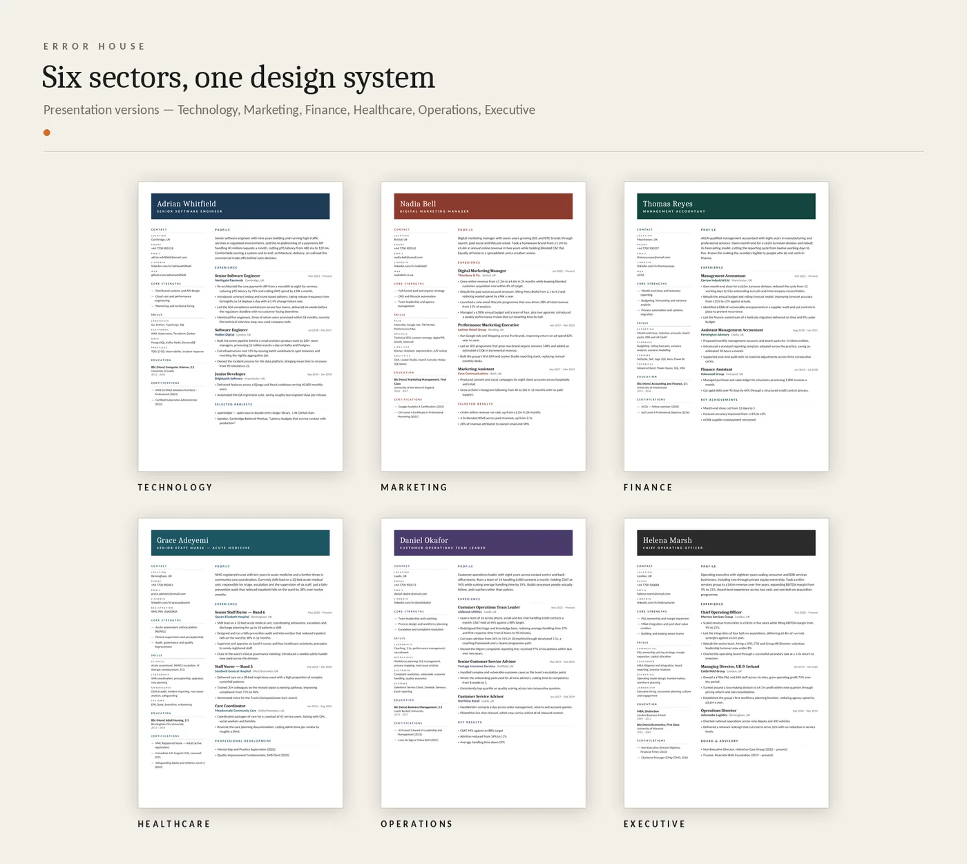
Same content, laid out for a person: an accent masthead, a sidebar carrying contact details, strengths, skills, education and certifications, and a wider column for the profile and the work history. Each sector gets its own accent colour, drawn from one palette so the six read as a family rather than six unrelated files.
This is the one you attach when you email a hiring manager directly, hand over in an interview, or put in a portfolio. It is explicitly not the one you upload to a job portal, and the pack says so in writing — a template that does not tell you when to use it is only half a template.
Built in Word, on purpose
These are not exported from a design tool. Every template is generated as a real Word document with real paragraph styles, tab stops and list formatting, which means a client can open it, type over the sample text, and have the layout hold. A beautiful PDF that nobody can edit is a dead end for the person who has to update it in six months.
What a client gets
Both versions of their sector template as an editable .docx and a print-ready PDF, their content written into it, and a one-page guide covering which file to send where, how to edit without breaking the layout, and how to write a bullet that says something.
The sample names, employers and figures in the templates are invented. They are there to show the shape of a strong entry — a result first, then how it was achieved — because that shape is most of what separates a CV that gets read from one that gets skimmed.
Let's talk
Want your CV
in one of these?
Send me your current CV and the role you are aiming at. I will tell you what is holding it back before you pay anything.